JOB SEARCH RESULTS
Case Study
Role
I had just joined Glassdoor as a Senior Product Designer in charge of Jobs, both B2B and B2C experiences. I was part of a small team that consisted of myself as the designer, a PM, a Front End engineer, a Back End engineer, and a QA engineer. As the sole designer on the Jobs team, I was responsible for the UX/UI design, prototyping, user testing, and any other deliverables needed.
Challenge
Upon joining Glassdoor, I was immediately tasked with redesigning the Job’s B2C page. The Job’s B2C experience had been largely ignored; previously, the main focus had been on Reviews and building out the Job’s B2B platform. The result was that while many people came to Glassdoor to read reviews on companies they were looking to apply to, many of these users did not use Glassdoor to apply to said company.
Goal
Create a better and smoother user experience that would result in increased site usage, which would, in turn increase revenue collected from our B2B clients. This would be tracked through job clicks, which is when a user clicks “Apply” on a job posted on our site.
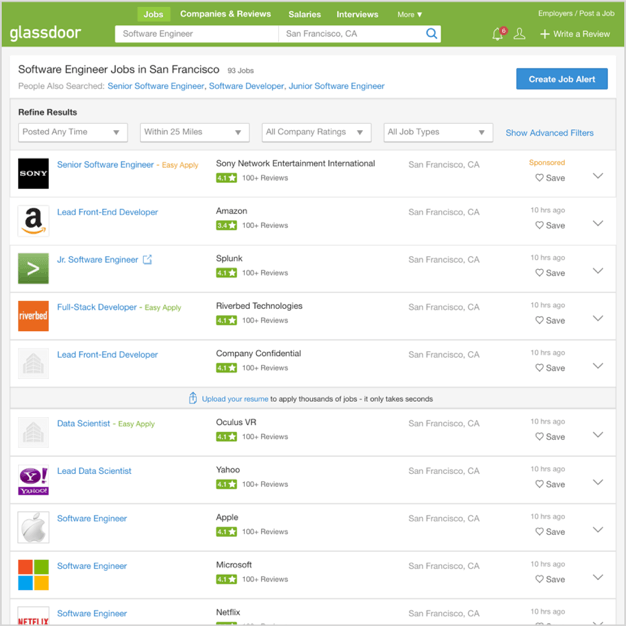
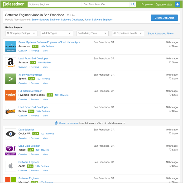
Original Experience
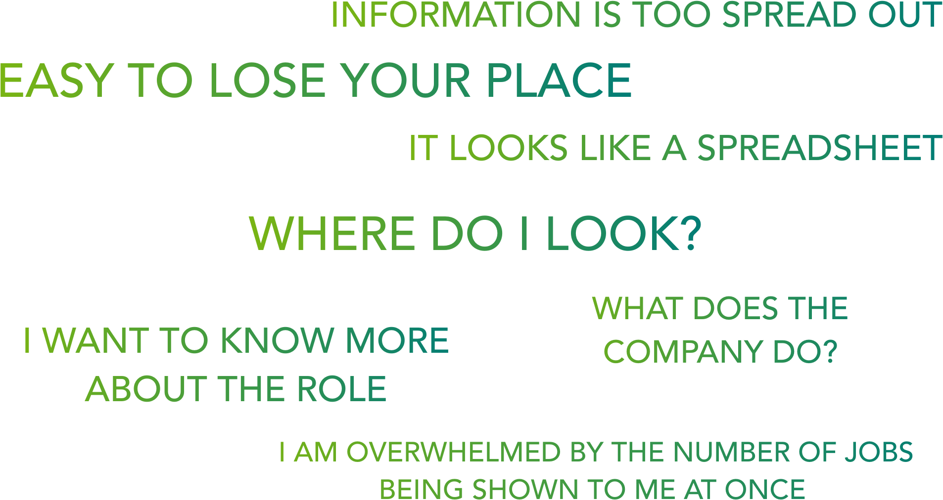
Conducted a series of usability tests to observe how users, both current and new, use our site during a job search scenario.
Job Search Flow

After running a search, a user would select a job that would pique their interest from the results shown in the listings page. Clicking on a job would take the user to the job details page.
From here, a user wanting to learn more about the company would click on About, which would take them to a new page showing additional information on the company. They would then click on reviews to see employee reviews for this company, which would also take them to a new page. Once they’ve decided to apply for this job, they now have to go back to the job details page to apply. They repeat this process for each job.
User Interviews
Each usability test was then followed by user interviews to gather insights into what current and prospective users thought of our existing product.
Hypothesis
I had an idea of what I wanted to change in the experience. I wanted to make changes to the layout to improve readability and findability. More importantly, no more having to click through multiple pages to learn about the company you are considering applying to. The job description, the about page for the company and reviews, everything a user needed to inform them whether they should apply to a job would be available without leaving the job listings page. With these changes, I believed I could empower users to easily and quickly find the right job for them.
Minimum Viable Product
To test my hypothesis and see if this idea had potential, we opted to experiment with a MVP version of the page. With minimal changes to the existing design, I added the features I thought the users would find helpful.
I basically shoehorned the information I felt users needed into the old design. It wasn’t pretty, but we wanted something we could turn around fast. The sooner we found out if the idea had merit, the sooner we can either work on improvements or move on to something else.
MVP Version
Within the job listings page, a user could now see snippets of the job description, company info, reviews, and more when revealed through a drawer.
The MVP version was implemented almost as quickly as it was designed. It was A/B tested to a very small percentage of our users, resulting in a 20%+ improvement in job clicks.
Explorations
With the MVP version having received positive results. I decided to move forward with further explorations.
Exploration A
What worked
Slightly bigger logos.
Filters moved up for better visibility.
New way to open/close details.
What didn’t work
Details need to be more visible.
Grid layout still affects findability, user feedback:
“I don’t know where to look”
Exploration B
What worked
Less overwhelming. Job detail, reviews, and more tab are visible by default. Grouping information that is related to each other increases findability.
What didn’t work
Cards are too big; there are not enough job results visible. Logo draws too much attention ( not all logos are equally recognizable ).
Exploration C
What worked
I got rid of the extra spacing. Kept some of the card version changes (Co. name near logo). Tabs are visible by default.
What didn’t work
Too crowded on the left-hand side. Not very balanced.
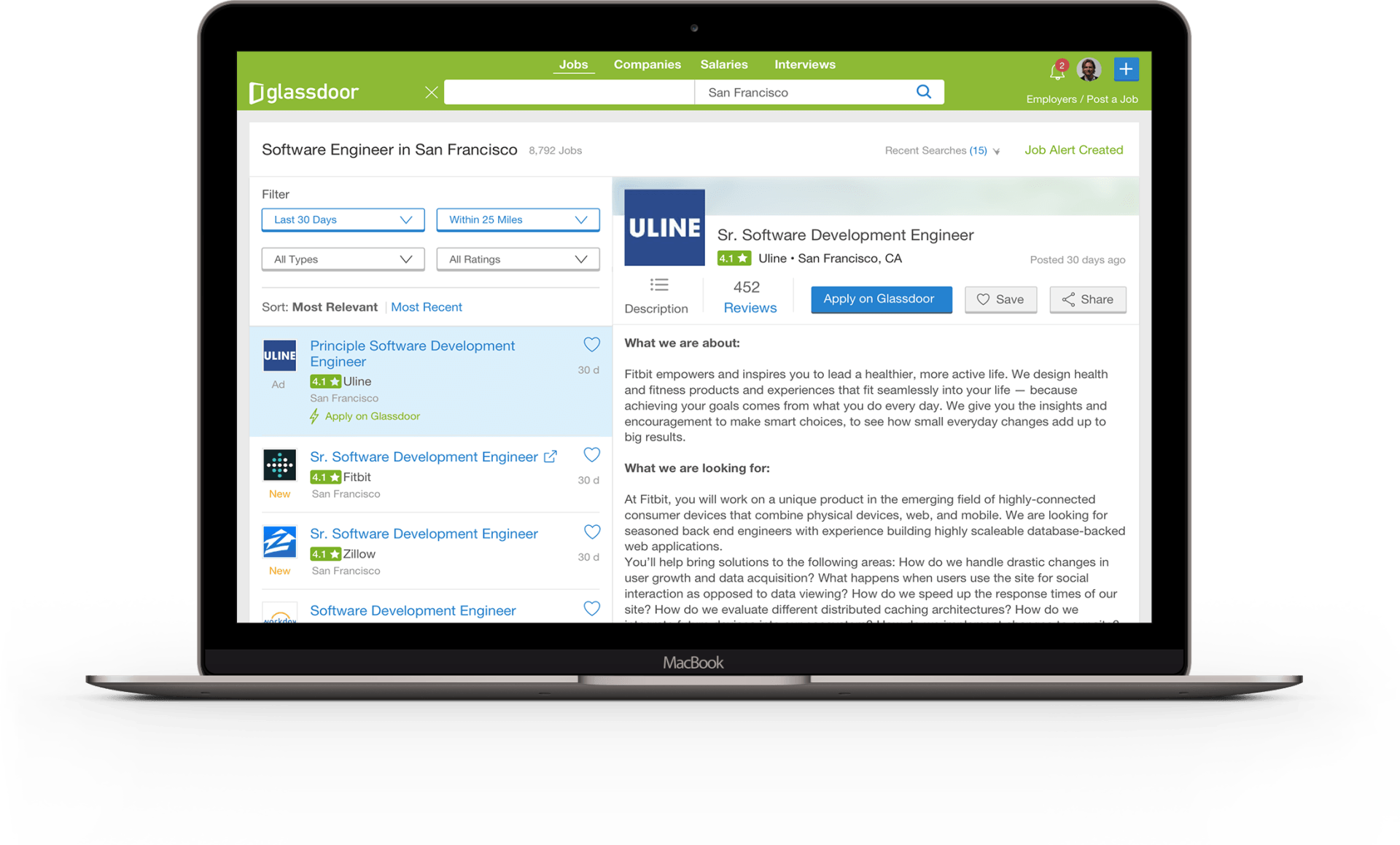
Two Panes
The previous explorations lead me to try out a version that consisted of two independently scrolling panes.
This allows for a full job description to be displayed as well as multiple reviews. The review and company pages still exist, but now there’s almost no need to go there. You can also apply for the job from this page.
Outcome
The “Two Pane” design was fairly successful in meeting its goal. It resulted in a much better user experience that increased site usage; we saw a 63% increase in job clicks. Following this success we set out to continue to explore new features and tweaks we felt would further improve the user's experience.