EHR Dashboard
Case Study
Overview
I was tasked with reviving and leading the efforts for a new EHR Dashboard. My goal was to understand the needs of our users and utilize those learnings to define the vision and purpose of a new EHR Dashboard.
Understanding the problem
In order to understand the issues with the existing dashboard, I poured over past user research as well gathering new insights through user interviews and on-site visits.
Original Experience
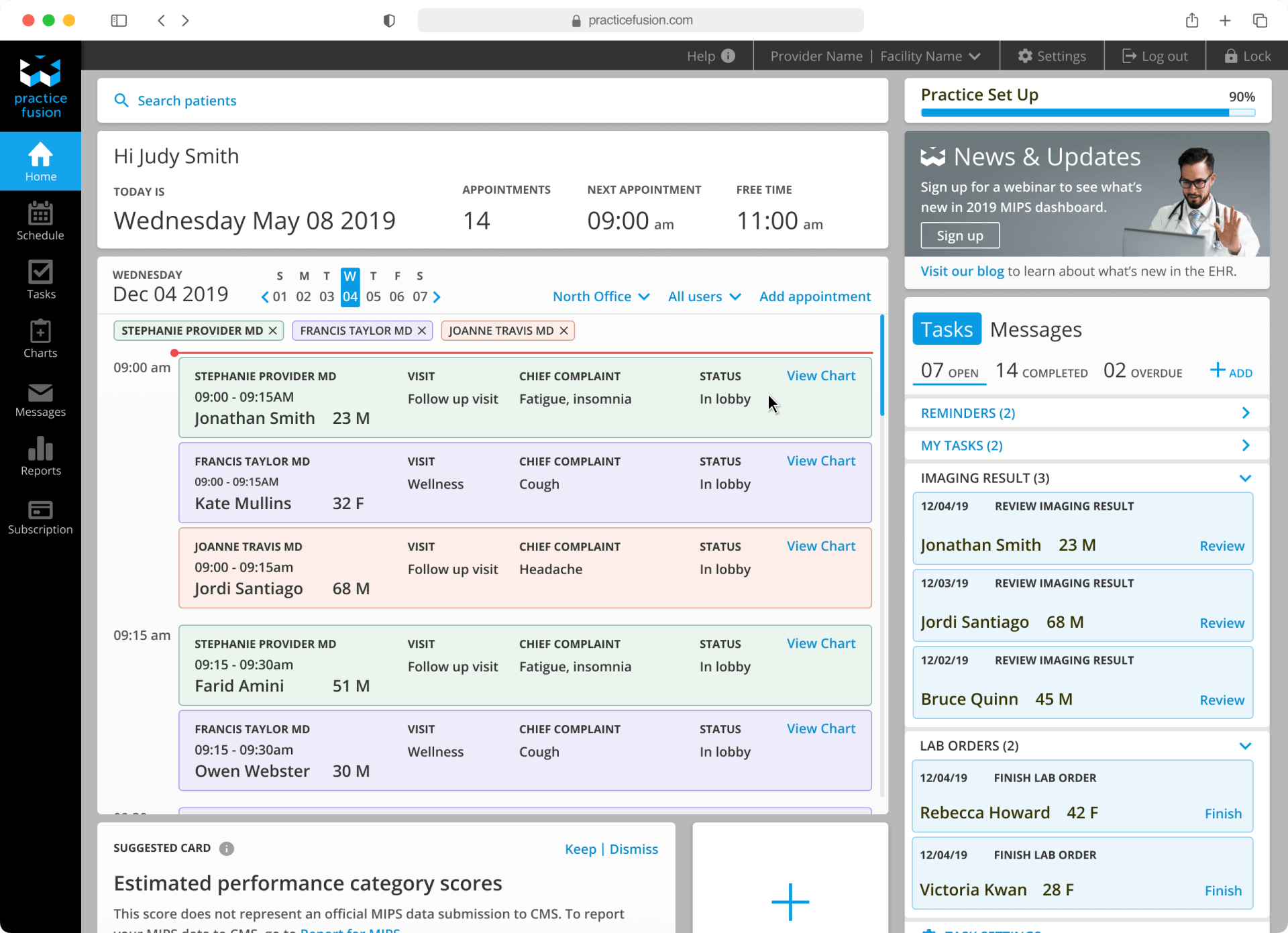
The dashboard is the first screen a user sees after log in. Over time it has become a dumping ground for various product initiatives.
User Feedback
User interviews with a focus on feedback on the existing dashboard helped get a clear picture of our users pain points and perception of the dashboard.
On Site Visits
Worked with the user research team to schedule on-site visits with medical practices who use our EHR. The focus of these visits was to observe and talk with users in varying roles within the practices as they went about their usual day to day workflows. During these visits, usage patterns arose in certain areas of the EHR.

Scheduler
All staff members of the practice use the scheduler in some capacity.

Tasks
Every users use of Tasks varies.

Messages
Most users check their Messages at the start of their day, and throughout the day as needed.

Education
Each practice had things they didn’t know about the EHR.

MIPS
Most practices struggled meeting MIPS (Merit-based Incentive Payment System) each year.

Additional Notes
Almost all of our clinical roles prep for the visits by looking at the past encounters and active Dx list.
Research Findings
As it stands, the dashboard provides little to no utility to our users past the initial EHR set up and is ignored in their daily workflow. The workflow of most of our users regardless of role, is to immediately navigate away from the dashboard to either the Scheduler, Tasks or Messages area.
Product Vision
I created work sessions with the rest of the design team to go over my findings, initiate a conversation over the new effort and brainstorm ideas.
Team Work Sessions

Understand the real experience of “a day in the life” of our varied customers.

Establish design direction as foundation for engagement of other people in the company and our customers.

Continuously test and iterate to further define design direction.
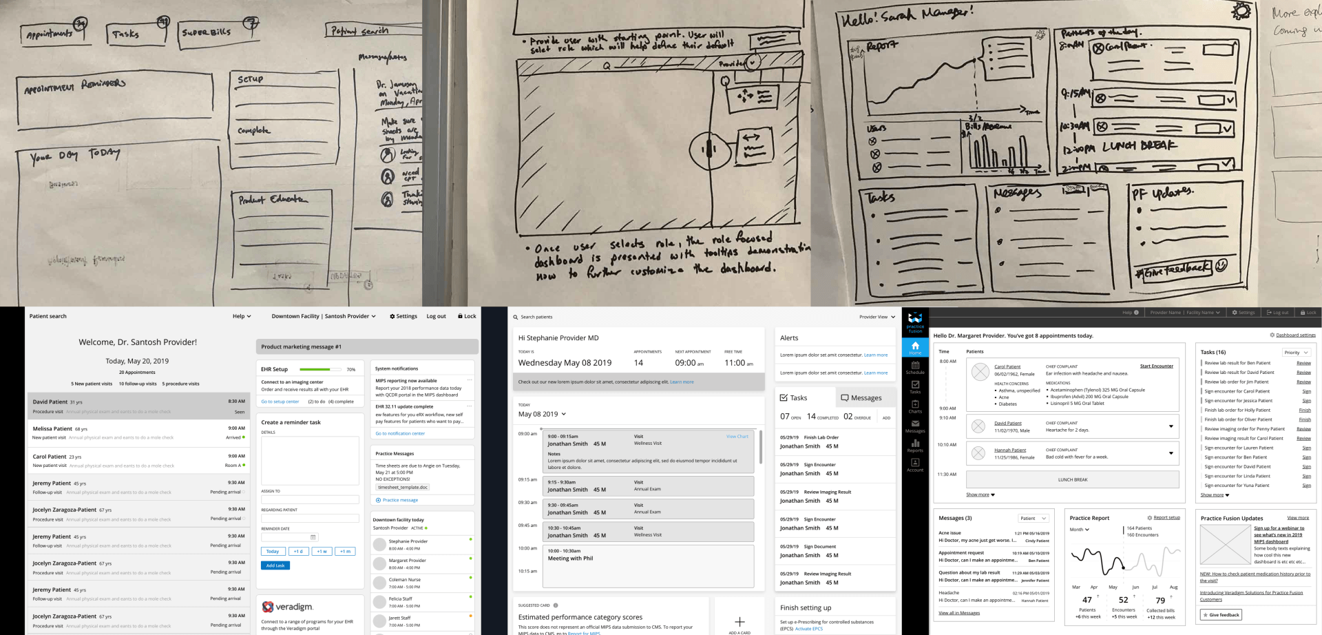
Iterations
I established a weekly work session with the rest of the team where they were invited to participate and come up with ideas and explorations of what an ideal EHR Dashboard would look like based on past and current research.
As the sessions progressed, designs where narrowed down, these were then presented to users. User testing feedback fed into a loop of feedback and iterations, ultimately leading into the multiple dashboard designs being consolidated into one design.
Designs
In order to bring utility to the dashboard we redesigned the space into a central location for high-level actionable information.
New Dashboard
Bringing the most used areas of our platform to the forefront, would allow our users to optimize their daily workflows.
Picture of the Day
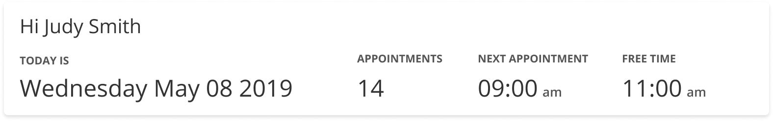
The Picture of the Day component allows our users to at a glance see what their day will look like.
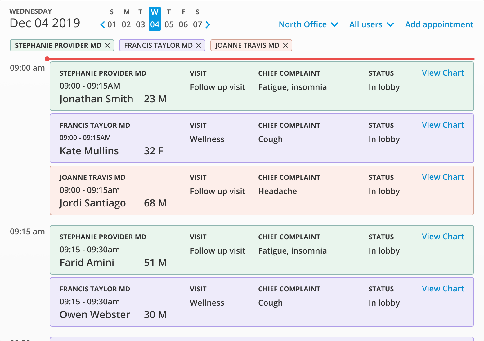
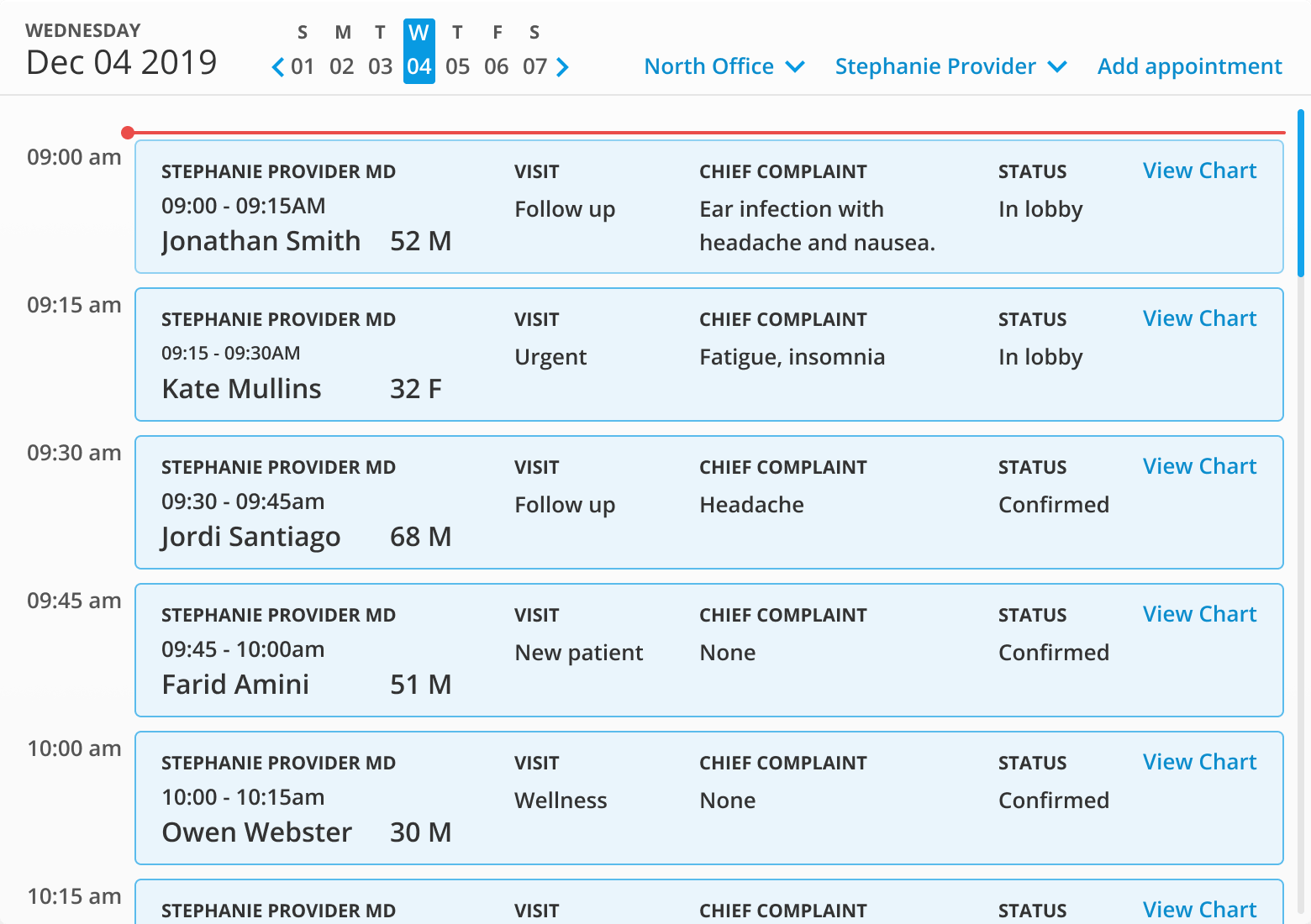
Scheduler
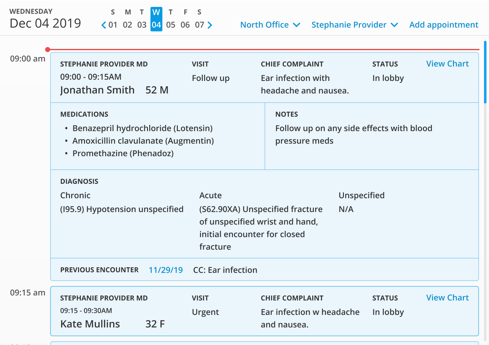
From the homepage, users would be able to see appointment times, visit type, chief complaint and patient status.
Doctors and nurse practitioners would have access to additional medical details like active medications and diagnosis.
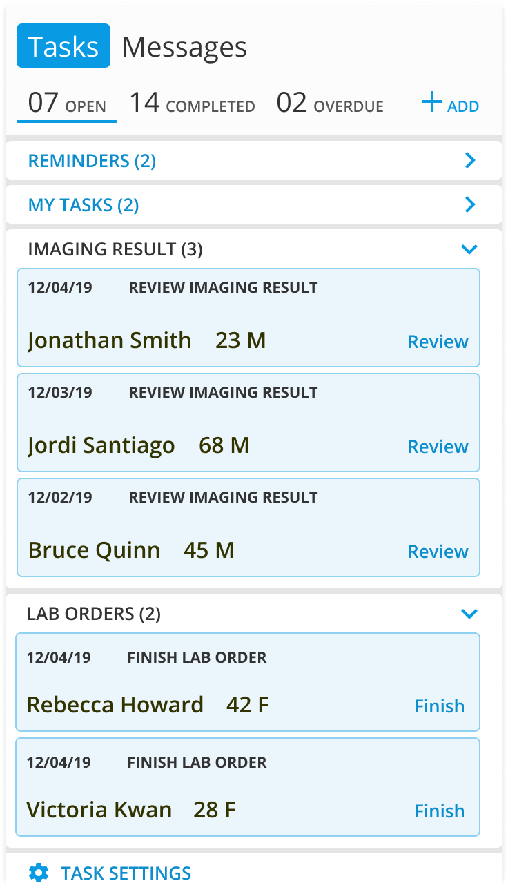
Tasks
The task module allows a user to see all their current open, completed and overdue tasks as well as create and assign new tasks.
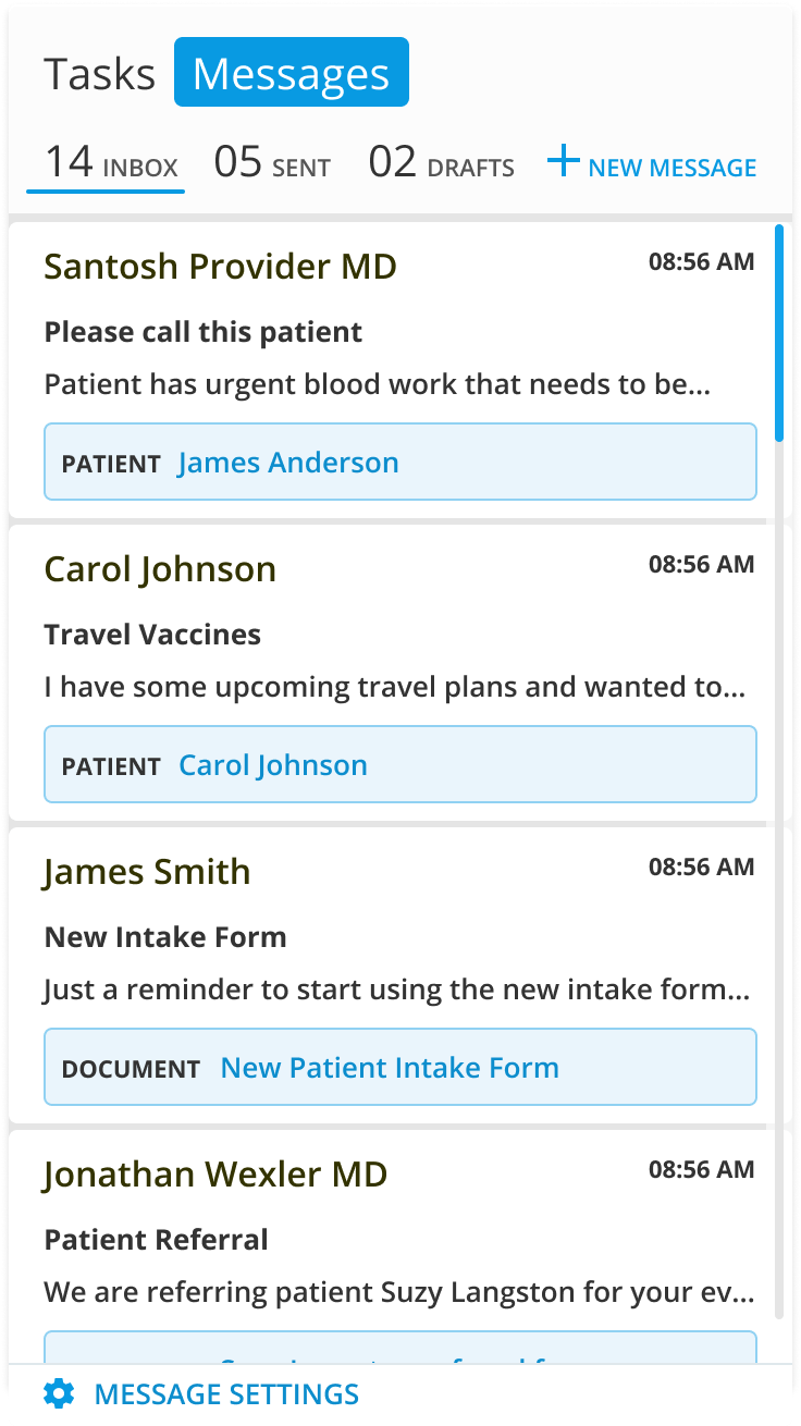
Messages
The messages module displays all messages within the practice as well as communication outside of the practice such as patient referrals and communications from patients.
Suggested Card
Occasionally we will suggest certain cards based on the user's activity or other past deficits with the option to keep or dismiss the suggested card.
The user also has the ability to manually add a card, doing so would display a modal where a user can select cards to be displayed from a list.
Suggested cards additionally provide a seamless way to surface newly created EHR features with the keep and dismiss actions allowing for tracking adoption.
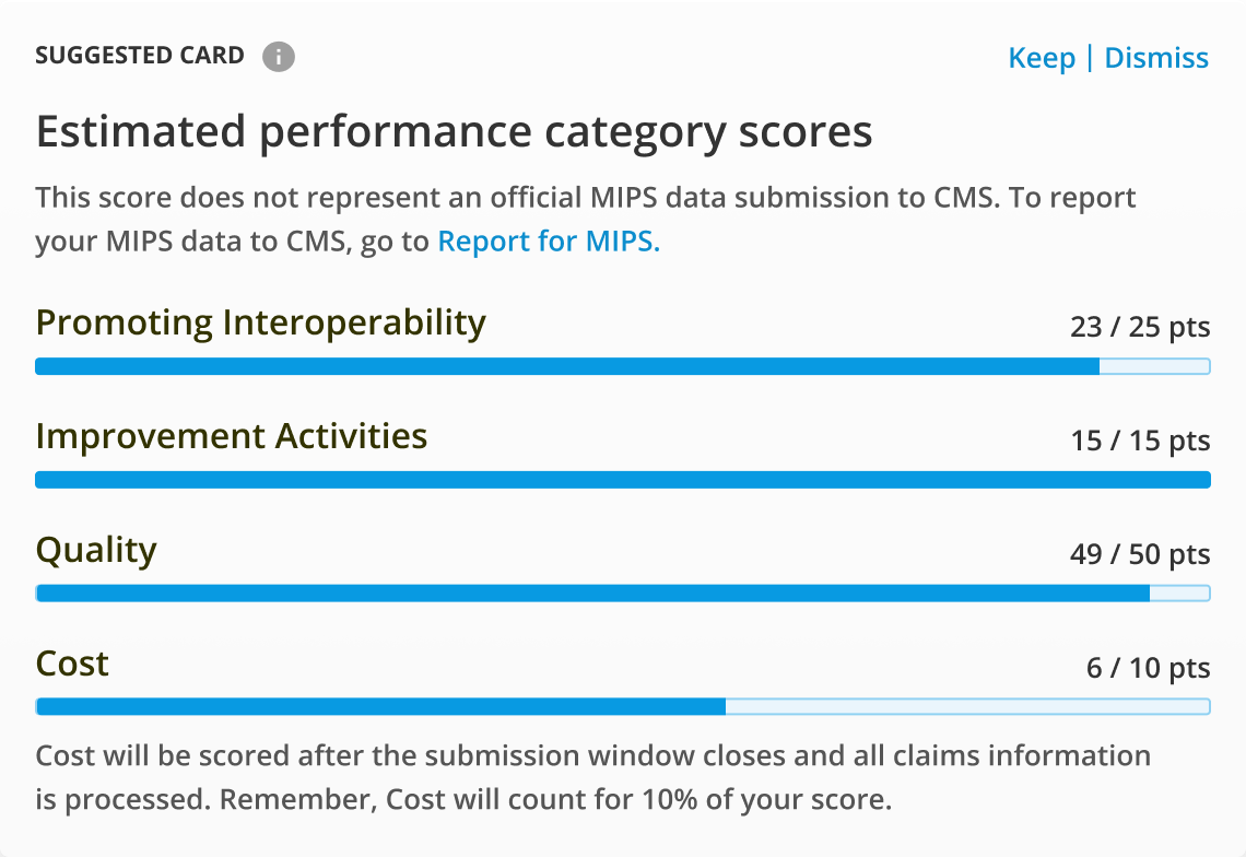
Ex. Practices that struggled meeting MIPS in past years would be suggested a card to watch specific measure calculations, and quick tips on how to meet the measure.
Outcome
The Dashboard redesign effort was successful in its goal to understand the needs of our users and utilize those learnings to define the vision and purpose of a new EHR Dashboard. However the project did not come to implementation due to product roadmap conflicts and shifts in priorities.